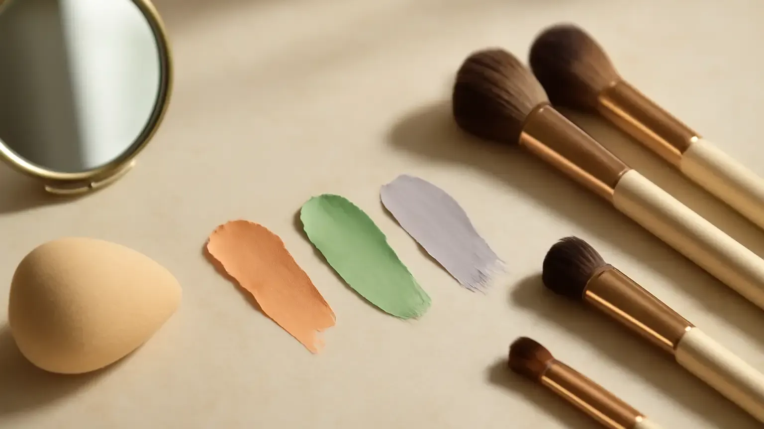
Makeup basics for color correction become much easier when you match the corrector to the unwanted colour: peach usually softens blue or purple shadows, orange suits deeper blue-brown discolouration, green tones down redness, and lavender brightens yellow or sallow areas. This guide is for beginners, especially anyone navigating Indian skin tones, uneven pigmentation or under-eye shadows. The key outcome is a lighter, thinner base—not a visibly orange, green or purple patch beneath foundation.
Colour correction is the step that helps makeup look more even before you add your usual concealer or foundation. It works through colour contrast: a carefully chosen opposite tone visually softens an unwanted cast. It does not erase texture, change your natural skin tone or replace skincare.
What colour correction actually does
A corrector adds a controlled tint to neutralise discolouration. For example, blue and purple shadows can look less prominent beside peach or orange, while green can visually balance surface redness. Once the colour looks less intense, a skin-toned concealer or foundation can cover the remaining tint.
The right shade depends on three things: the colour you see, the depth of that colour, and your own skin tone. The same under-eye area may need peach on fair to medium skin and a richer orange or terracotta-leaning corrector on deeper skin. The colour wheel is a starting point, not a rigid rule.
Which corrector goes where?
Peach corrector for blue or purple shadows
A peach corrector is often useful for mild blue, violet or grey-looking under-eye shadows, particularly on fair to medium complexions. It can also soften small areas of dull brown-grey discolouration. Choose a muted peach rather than an intensely pink shade if your skin has a golden or olive undertone.
For under-eye colour correction, place peach only over the shadow, usually near the inner corner and the hollow beneath the eye. Do not spread it across the entire cheek or eyelid unless that area also needs balancing.
Orange corrector for deeper blue-brown discolouration
Orange corrector for Indian skin tones can work well when dark circles or pigmentation appear deep blue, purple-brown or grey-brown. Medium-deep to deep complexions often need more warmth than a pale peach can provide. On very deep skin, a burnt orange, red-orange or terracotta corrector may blend more naturally than a bright orange.
Use the smallest amount that takes the grey or blue cast down a notch. If the area looks distinctly orange after blending, the corrector is too strong, too light or too widely applied.
Green corrector for redness
Green corrector for redness is intended for visibly red areas such as around the nose, individual blemishes or patches of flush. It should be dabbed precisely rather than swept over the whole face. A muted green is generally easier to control than a vivid mint shade.
Green is not automatically the best choice for every spot. If a blemish is mostly brown or has a purple mark, green may make it look dull or ashy. Match the correction to the colour that is actually visible in natural light.
Lavender corrector for yellow or sallow areas
Lavender corrector for dull skin can add visual freshness to areas that look yellow, sallow or overly warm. It is usually best used in a very thin layer on the high points of the face or on a larger dull-looking area, not directly over blue-purple under-eye shadows.
On golden, olive or deeper complexions, too much lavender can look grey. Try it on one small area first, then compare it in daylight before applying more.
How to use colour corrector under foundation
- Start with clean, comfortable skin. Apply moisturiser and sunscreen in the daytime, then allow them to settle. Makeup applies more evenly when the surface is not wet or slippery.
- Assess the colour in daylight. Look at the area without magnifying your concern. Decide whether it is mainly blue, purple, red, brown, grey or yellow.
- Choose a close colour match. Use peach for lighter blue-purple shadows, orange or terracotta for deeper blue-brown areas, green for redness and lavender for yellow dullness.
- Apply a pin-sized amount. Place dots only where correction is needed. A small synthetic brush can provide precision; a clean fingertip can warm and tap the product into the skin.
- Tap, do not drag. Press the edges until they look sheer. The goal is for the discolouration to appear softened, not for the corrector to look opaque.
- Pause before covering. If the colour still shows strongly, add a half-layer. Several thin layers are easier to control than one thick coat.
- Add concealer or foundation. Press a skin-toned product over the area using a sponge, brush or fingertip. Avoid vigorous rubbing, which can move the corrector away.
- Set only where necessary. A small amount of finely milled powder can reduce creasing, but heavy powder may emphasise under-eye texture.
Corrector and concealer order for a natural base
The usual corrector and concealer order is corrector first, then skin-toned concealer, followed by foundation if you are wearing it. There is one practical exception: if you prefer applying foundation first, you can use it as a light veil over the corrector and then conceal only what remains. Both methods can work; the better choice is the one that prevents over-application.
For a targeted routine, use corrector, then concealer, and stop. For a full-face routine, apply corrector to selected areas, use a thin layer of foundation over the face, and finish with concealer where extra coverage is needed. This keeps the complexion from becoming uniformly heavy.
How to layer foundation without making the base muddy
Foundation should unify the skin, not be used to scrub away or mix the corrector. Choose a shade that matches your face, jaw and neck rather than choosing a lighter foundation to compensate for dark circles. A mismatched pale base can turn warm corrector grey or orange.
When you want a natural result, a sheer coverage foundation is often easier to layer over precise correction. Press it on instead of buffing repeatedly across corrected areas. If you need a full coverage foundation, use less corrector first; strong foundation plus a thick corrector can create a dense, muddy finish.
Work in sections: correct one under-eye or cheek area, add foundation, then compare it with the untouched side. This makes it easier to see whether you need another layer. Keep the centre of the face light and build coverage only on pigmentation or redness that remains visible.
How much corrector should you apply?
Begin with less than you think you need: one tiny dot for a small mark and two or three very small dots for an under-eye area. After tapping it out, the skin should look more neutral but still show some natural skin variation. If the corrector is obvious from arm’s length, reduce the amount or use a closer shade.
Colour correction is not a contest to achieve complete opacity at the first step. The foundation or concealer that follows provides the coverage. Corrector only needs to remove the distracting colour cast.
Common colour correction mistakes
- Using the same shade everywhere: A peach corrector for dark circles is not a universal solution for redness or yellow dullness.
- Applying too much product: Excess pigment is harder to cover and more likely to crease.
- Ignoring undertone: Cool, warm and olive undertones affect how peach, orange, green and lavender appear after blending.
- Correcting texture with colour: A corrector cannot flatten bumps, fill pores or remove dryness. Use a suitable moisturising and base-prep routine instead.
- Testing only under indoor lighting: White bathroom light can make a blended base look different from daylight.
- Layering by rubbing: Sweeping foundation back and forth can lift the correction and leave streaks.
- Skipping a skin check: Do not apply makeup to broken or actively irritated skin. Stop using a product if it causes persistent burning, swelling or a rash; seek medical advice for severe or ongoing symptoms.
Which routine suits you?
For mild under-eye shadows: Try a muted peach, followed by a thin layer of concealer. You may not need foundation over the area.
For deeper pigmentation: Use orange, red-orange or terracotta according to your skin depth, then apply a matching concealer in light layers. A foundation with moderate coverage can unify the rest of the face.
For isolated redness: Tap a muted green only on the red patch, then press concealer or foundation over it. Keep the surrounding skin light.
For an overall dull cast: Test a sheer lavender layer on the affected area, but avoid covering your entire face unless you have checked the result in daylight.
For no-foundation days: You can use colour corrector without foundation, but choose a product close to your complexion and apply an exceptionally thin layer. A skin-toned concealer around the edges will make the result less noticeable.
Makeup basics for color correction: the simple takeaway
Identify the unwanted colour first, select its soft complementary tone, and apply the smallest amount that visibly helps. Peach suits lighter blue-purple shadows, orange and terracotta help with deeper blue-brown discolouration, green tones down redness, and lavender can brighten yellow dullness. Finish with thin, pressed layers of matching base makeup. Good correction should make your foundation look more even—not announce that a corrector is underneath.
Products that may help with this routine
Choose only what fits your skin, hair or personal needs. Use the links below to view current options on Amazon India.
Frequently Asked Questions
Which colour corrector should I use for dark circles?
Use peach for mild blue or purple shadows on fair to medium skin, and orange, red-orange or terracotta for deeper blue-brown shadows on medium-deep to deep skin. Apply it only where the darkness is visible.
How do I use colour corrector under foundation?
Assess the discolouration in daylight, apply a tiny amount of the matching corrector, tap it sheer, then press foundation or skin-toned concealer over it. Build thin layers rather than rubbing on a thick coat.
Is peach or orange corrector better for Indian skin?
It depends on your skin depth and the darkness you are correcting. Peach often suits mild shadows on fair to medium skin, while orange or terracotta is usually more effective for deeper blue-brown discolouration on medium-deep to deep skin.
What colour corrector covers redness?
A muted green corrector can visually balance visible redness around the nose, blemishes or flushed areas. Use a precise, thin application and cover it with concealer or foundation.
How much colour corrector should I apply?
Start with one tiny dot for a small mark or two to three small dots for an under-eye area. Blend until the colour looks softened, not opaque, and add only a half-layer if needed.